
Loretto School
Rebranding Tradition for Tomorrow

Client Overview
Loretto School is one of Scotland’s leading independent co-educational day and boarding schools. Set on an 85-acre campus in Musselburgh, East Lothian, just six miles from Edinburgh, it combines heritage, academic excellence and a strong sense of community.
Project Brief
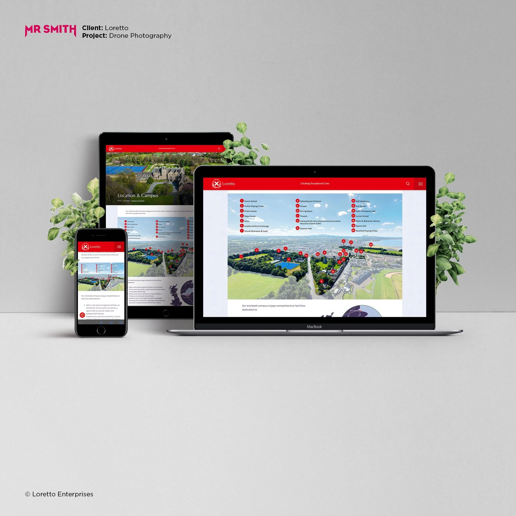
Loretto approached Mr Smith Creative looking for a full brand refresh. Their existing identity felt dated and no longer reflected the school’s ambition or position in a competitive private education sector.
The brief was broad: reimagine the brand identity, redesign the prospectuses, revamp the website, and create a suite of marketing materials that would reflect both tradition and progress.
Creative Approach
From the outset, it was clear this would be a balancing act. Loretto’s brand history stretches back centuries, and certain elements – such as the red colour and the Loretto crest – were considered untouchable.
The creative challenge was to preserve this legacy while introducing a more contemporary visual language. We aimed to project a sense of confidence, clarity and character, without losing the school’s traditional roots.
Design and Delivery
A new wordmark was developed using a refined serif typeface. This subtle design choice nodded to classicism while feeling fresh and current.
We expanded the colour palette to introduce deep aubergine tones. These gave the brand more depth and helped the signature red stand out with purpose.
The new identity was rolled out across all touchpoints – including signage, the school website, printed prospectuses and video content. A brand toolkit was created using Canva, enabling the in-house team to produce professional marketing materials quickly and consistently.
Results
The rebrand received an enthusiastic response from staff, pupils and parents. Early indicators show a noticeable uplift in engagement, with increased enquiries and applications since the new identity launched.


Review
“Andy brings a magic to his work that synthesises the history and traditions with modern values and approaches into one complete look.
His careful listening to our requirements, alongside his brilliant skill to keep things clean and fresh allow for a complexity in design that looks simple but is far from it. We return to him again and again as his work is so well done.
From our branding, to our website and annual publication, we have received countless compliments from our stakeholders about his work, and that in turn reflects well on us.
As well as being talented he is a great guy and easy to work with.
I will use Andy again and again – and recommend him wholeheartedly.”
Josie Orr, Head of Admissions


