North Berwick Trust – A New Identity Rooted in Place
North Berwick Trust
North Berwick Trust is a long-established charitable organisation dedicated to supporting the local community. Originally founded in 1973 by North Berwick Town Council, the Trust has helped enhance recreation, education, amenities and wellbeing in the area for over 50 years. In June 2018, the charity evolved into a new entity, officially becoming The North Berwick Trust Ltd, marking a fresh chapter in its journey.
The Brief
With this change came the need for a new brand identity that reflected both the heritage and the future vision of the Trust. A creative pitch was issued, and I was invited to submit a proposal for the rebrand.
Creative Direction
Before putting pen to paper, I immersed myself in the town’s culture, character and visual language. I reviewed local branding, explored North Berwick’s online community spaces, and studied what locals associated with the town.
One image kept surfacing: the Bass Rock. A stunning natural landmark, certainly,but it appears in countless East Lothian brands, from sports clubs and cafes to visitor attractions. It is visible from many towns along the coast, not just North Berwick, and felt too generic to own.
I wanted something more distinct—something recognisably North Berwick, but less expected.
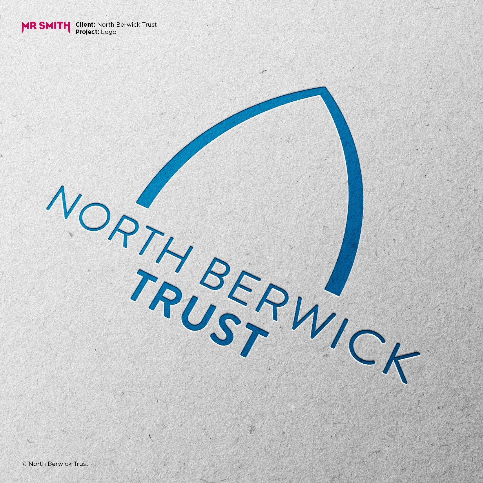
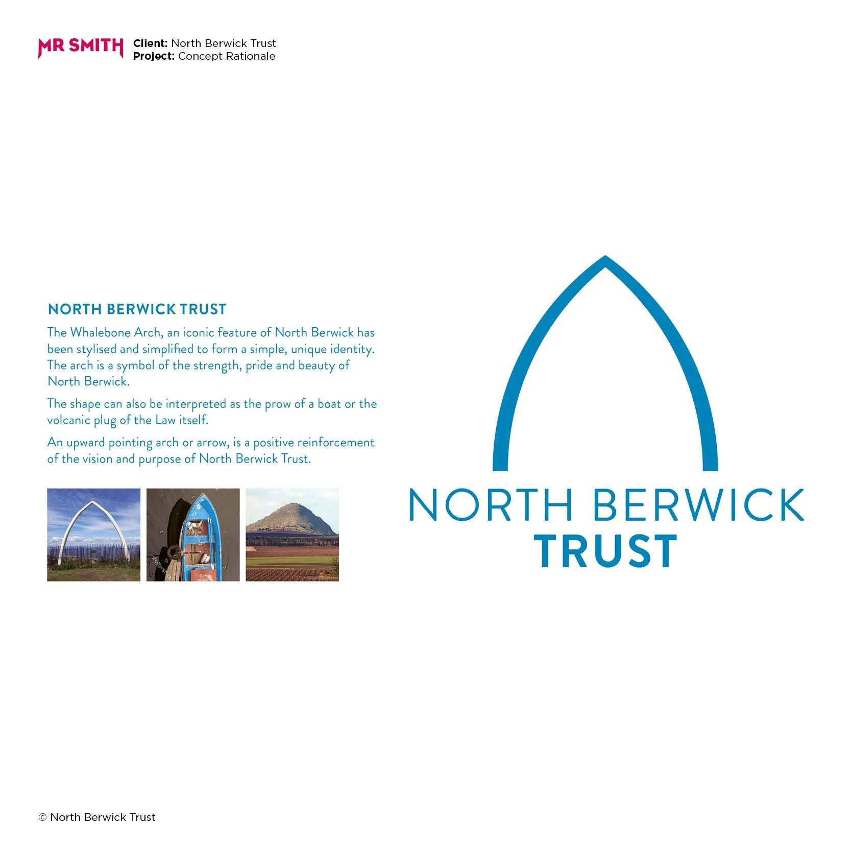
That led me to North Berwick Law, the ancient volcanic hill that rises above the town. On top of it sits a striking whalebone arch—a bold sculptural form, rich with local meaning. The original whalebones were replaced in 2007 by a permanent structure after centuries of wear and weathering. For me, this symbol offered the perfect blend of story, location and identity.

Design Execution
I developed a clean, confident motif based on the whalebone arch. It felt elemental, iconic and immediately ownable. The Trust loved it, and I was awarded the project.
Then came a poignant twist. One of the other designers I was up against in the pitch was my friend and mentor, the late Mick Dean. We shared a studio, and though I won the work, I invited Mick to join me in delivering the final identity. His eye for craft and detail beautifully complemented my focus on story and symbolism.
Outcome and Legacy
The result was a striking and enduring visual identity that now lives proudly across the town—from signage and print to digital communications. It stands as a tribute to North Berwick’s past and future, and to the creative partnership with Mick, whose influence continues to shape my work.
This project remains one of my proudest—a thoughtful, place-based identity with personal meaning and lasting impact.
