
Maitri Trust
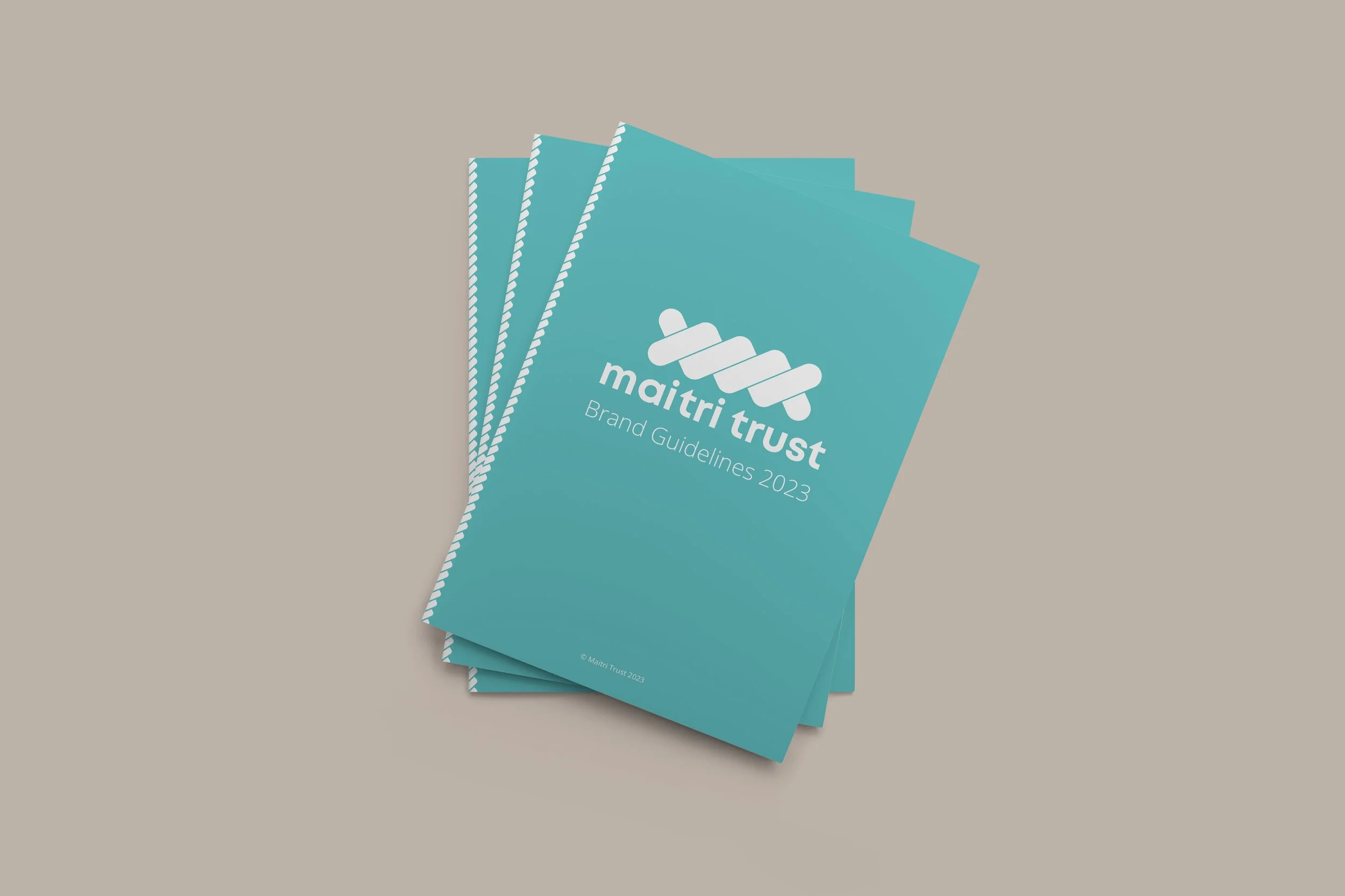
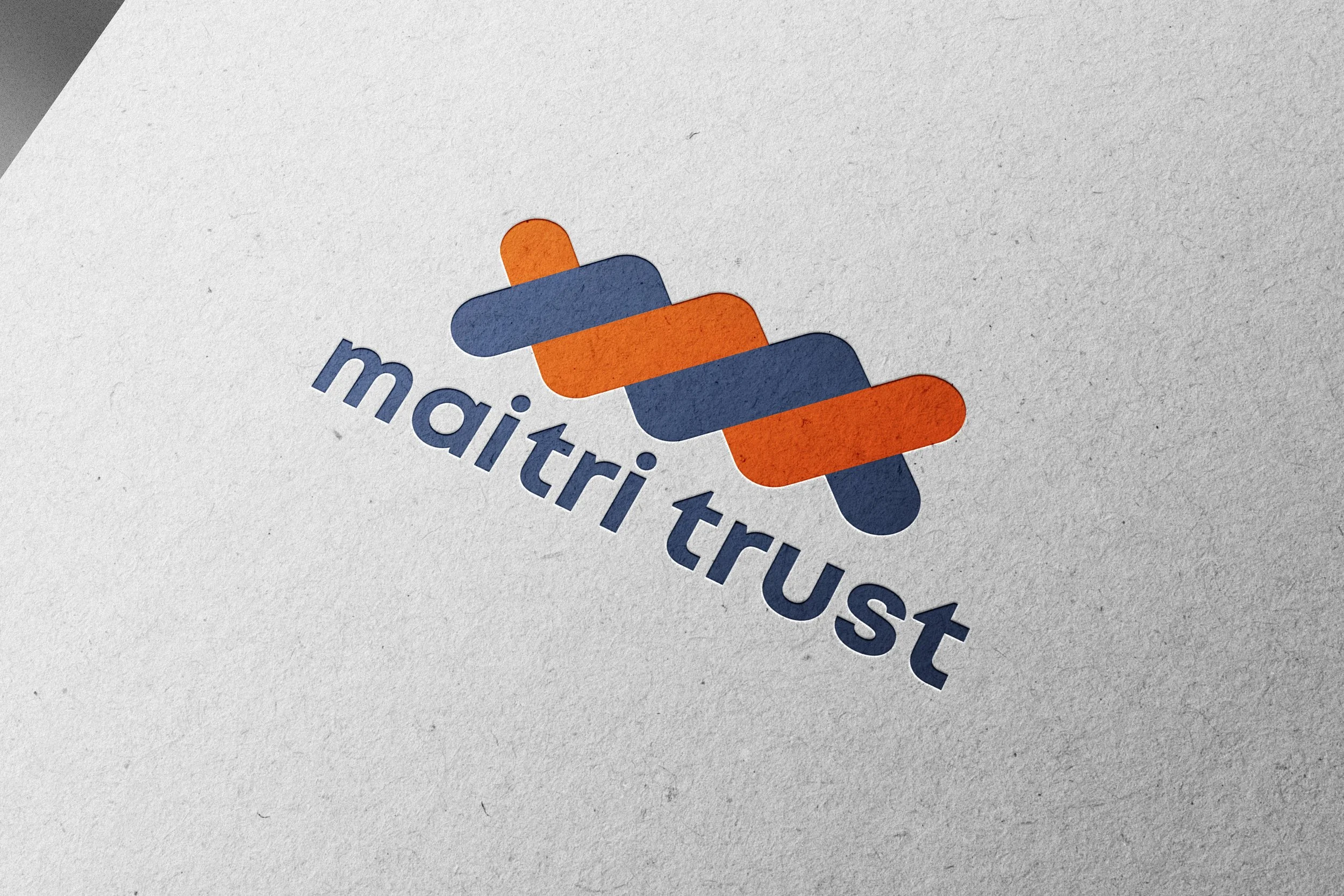
This charity needed a brand that felt human, not institutional. The identity was built around connection and collaboration. The rope inspired symbol reflected partnership, education and shared progress. Paired with authentic photography, a new brand tone of voice, fresh colour palette and a visual style guide gave the charity a stronger sense of purpose across everything they do.
Project in partnership with Transform Creative.
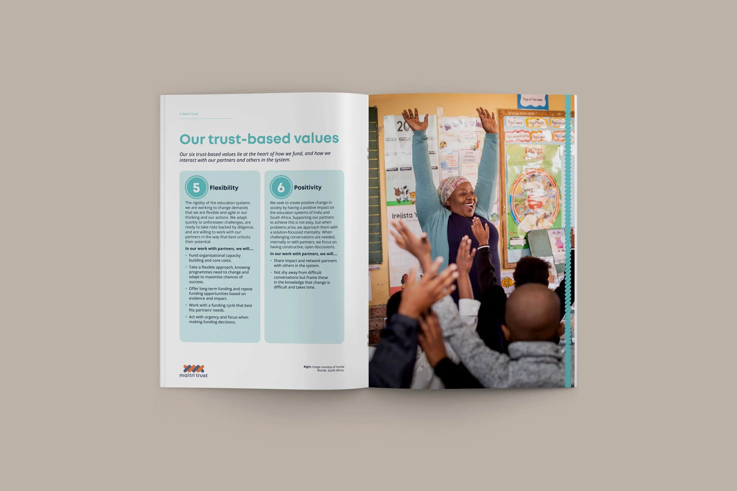
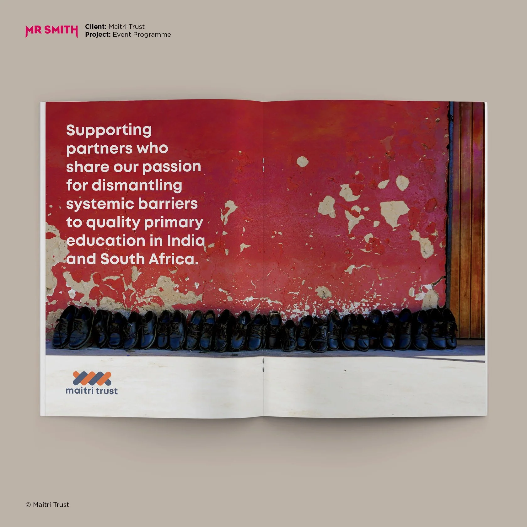
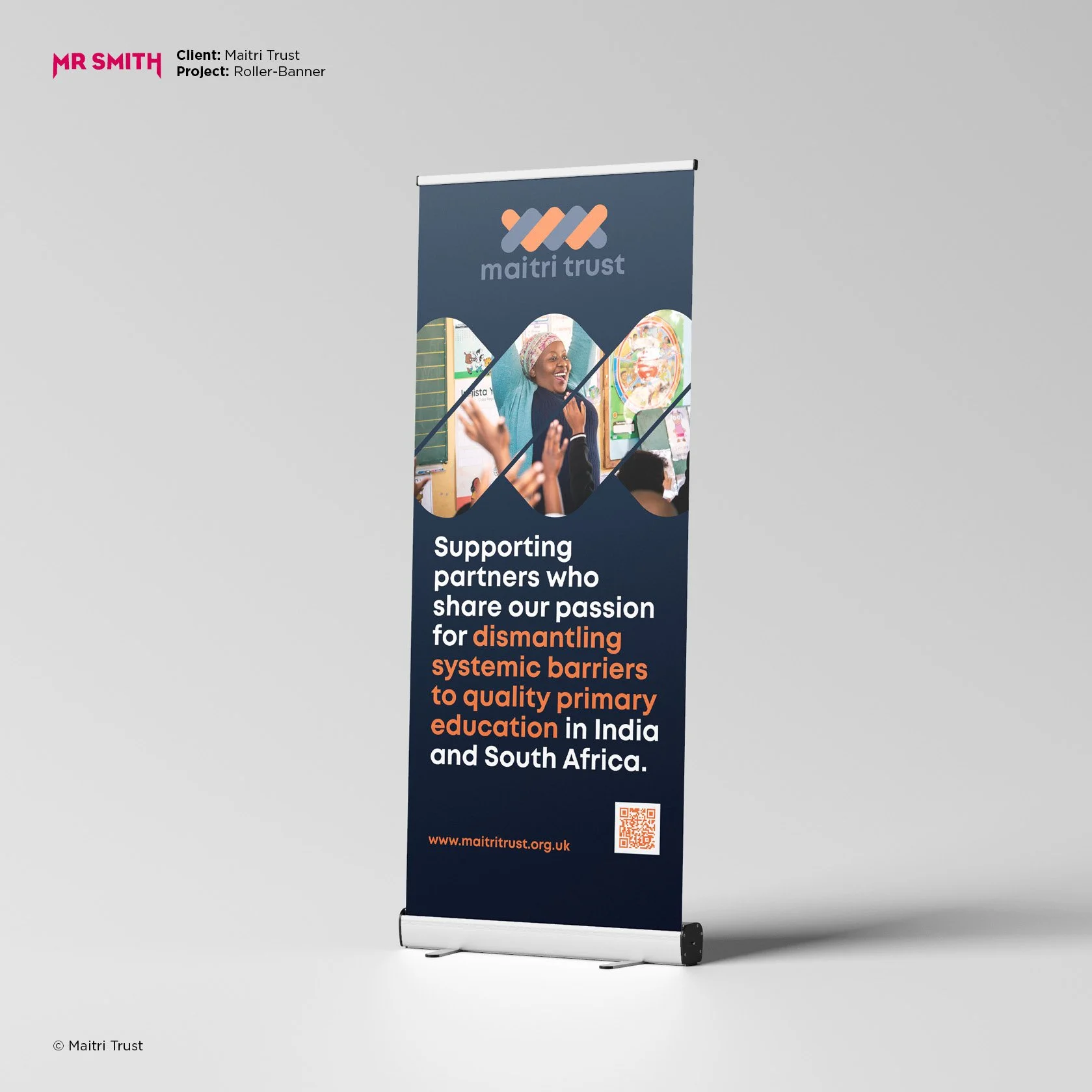
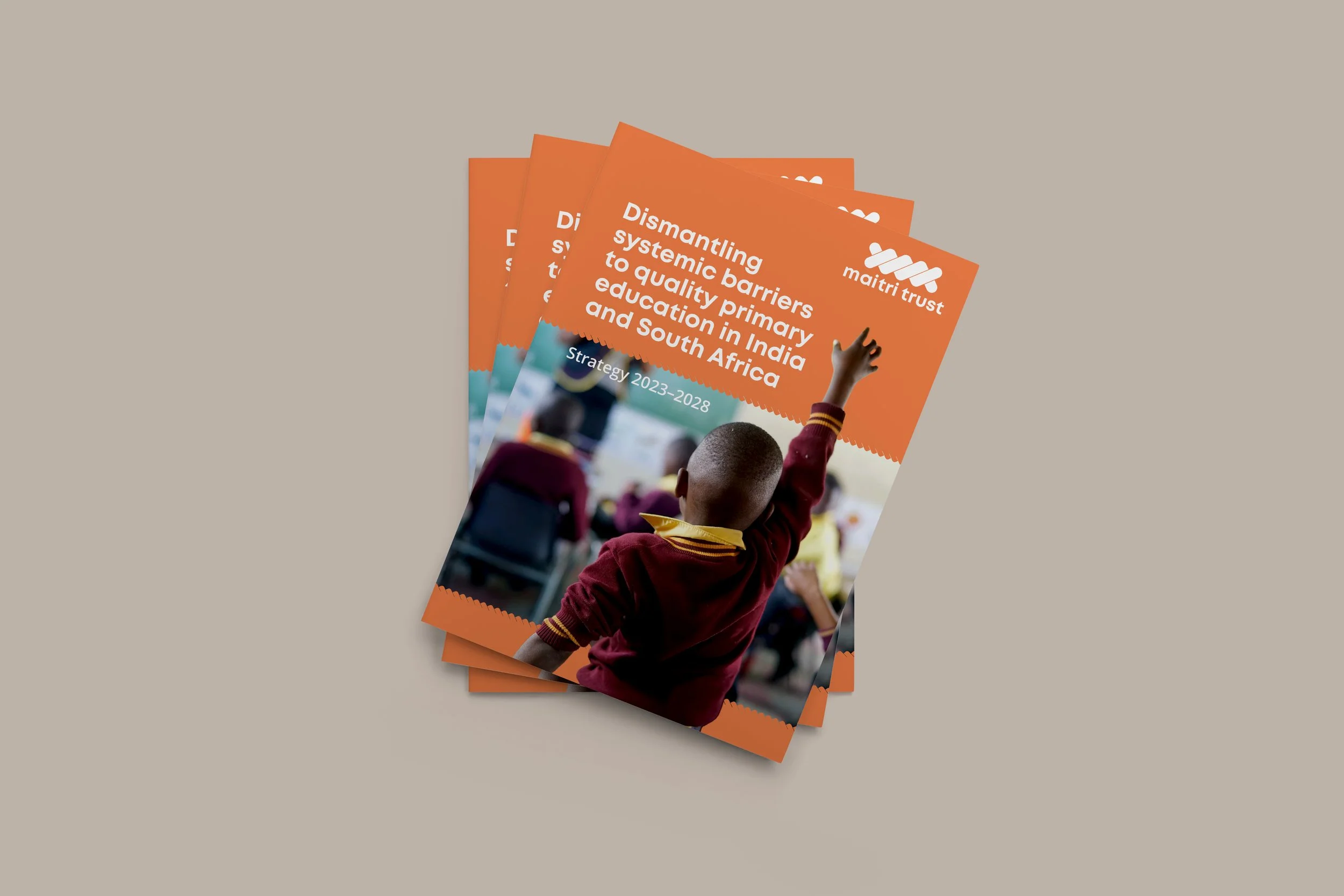
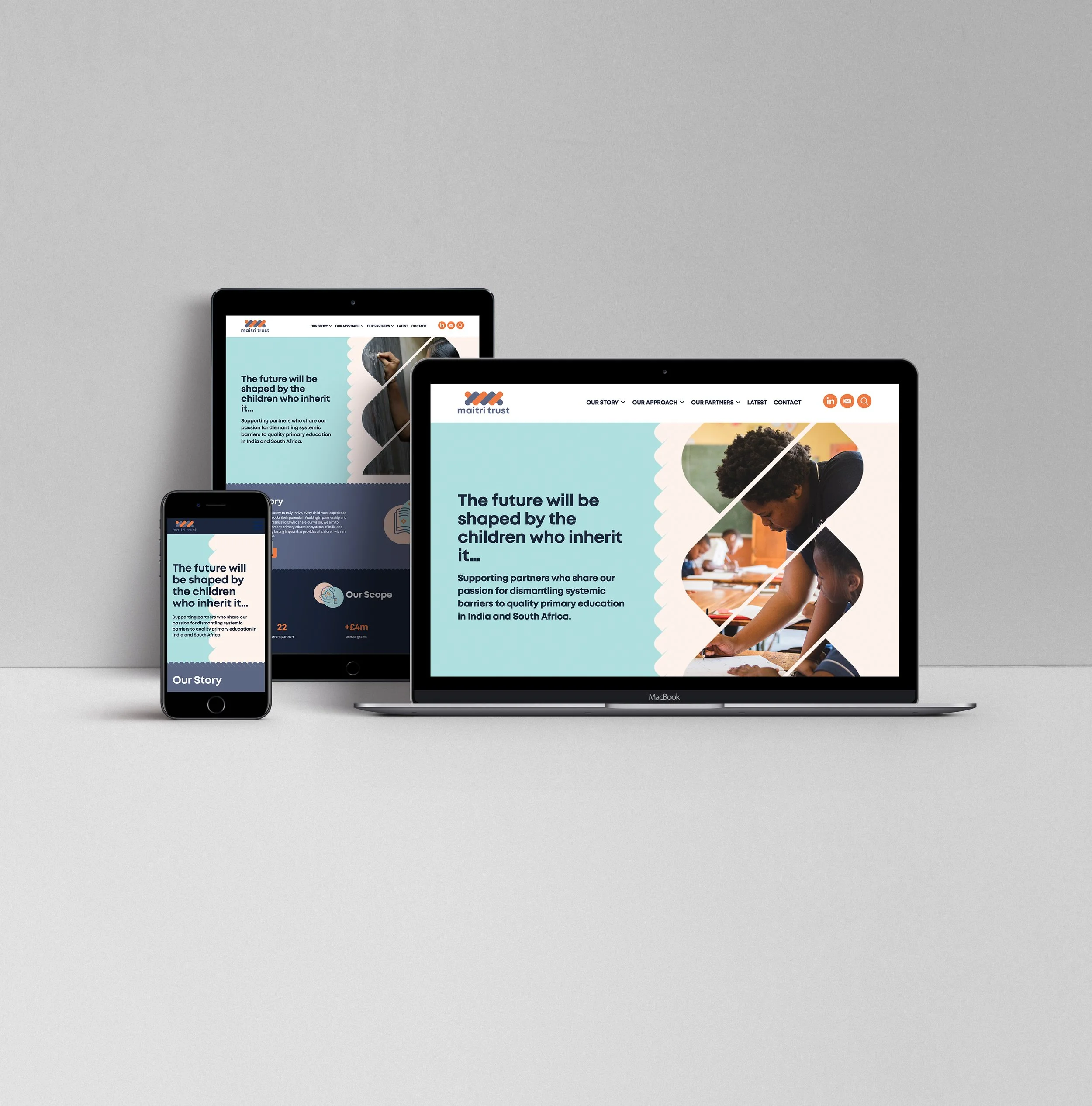
The new identity gave Maitri Trust a more meaningful way to express who they are and how they work. Connection sat at the centre of everything, from the symbol and choice of photography to the tone of voice and visual language. It helped bring consistency across the organisation, whilst giving the charity a stronger sense of purpose and direction. The brand became a shared framework that reflected collaboration, education and long term impact. A story built around people, partnership and meaningful change.
“Andy is a pleasure to work with and goes out of his way to ensure his clients are happy. During our brand refresh, he approached everything with a tonne of flexibility, responding positively to feedback at each stage, creating many different options for us to consider, and working closely with us to fine tune things until we were 100% happy with the end results. The materials and guidelines he produced, along with Jonothan’s wordsmithing and Pete’s website, have been game-changing in helping us tell our story”.
Kirsty Gordon
Communications Manager
Maitri Trust