
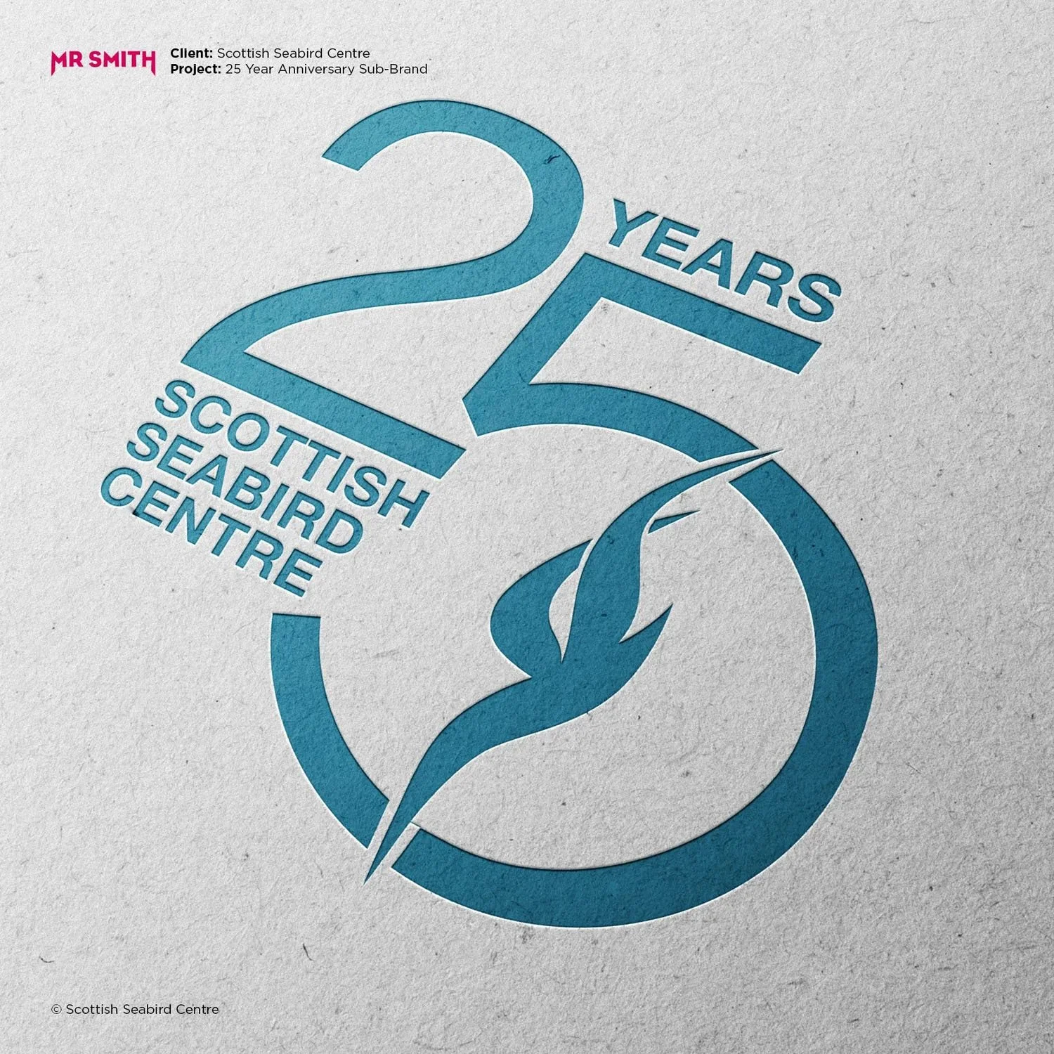
Scottish Seabird Centre - 25 Year Brand
For its 25th anniversary, Scottish Seabird Centre needed an identity that felt celebratory whilst staying true to its established brand. Built around a reworked ‘25’ and the iconic diving gannet, the design became a flexible symbol used across events, campaigns, signage and film. The project celebrated conservation, education and community impact, whilst looking confidently toward the future from its home in North Berwick, East Lothian.
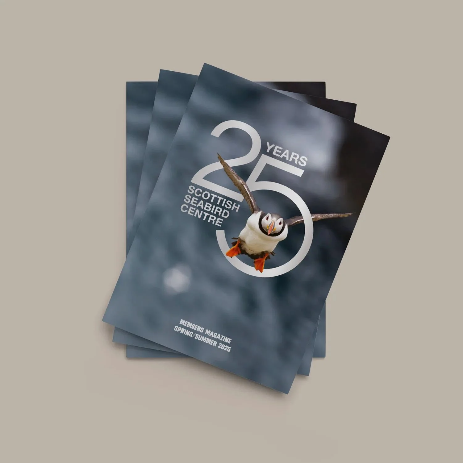
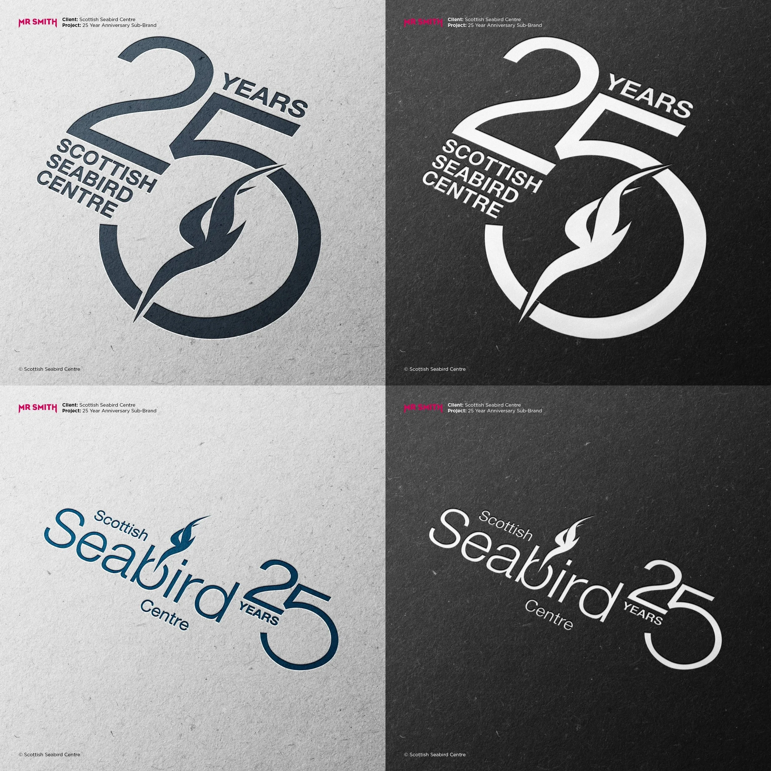
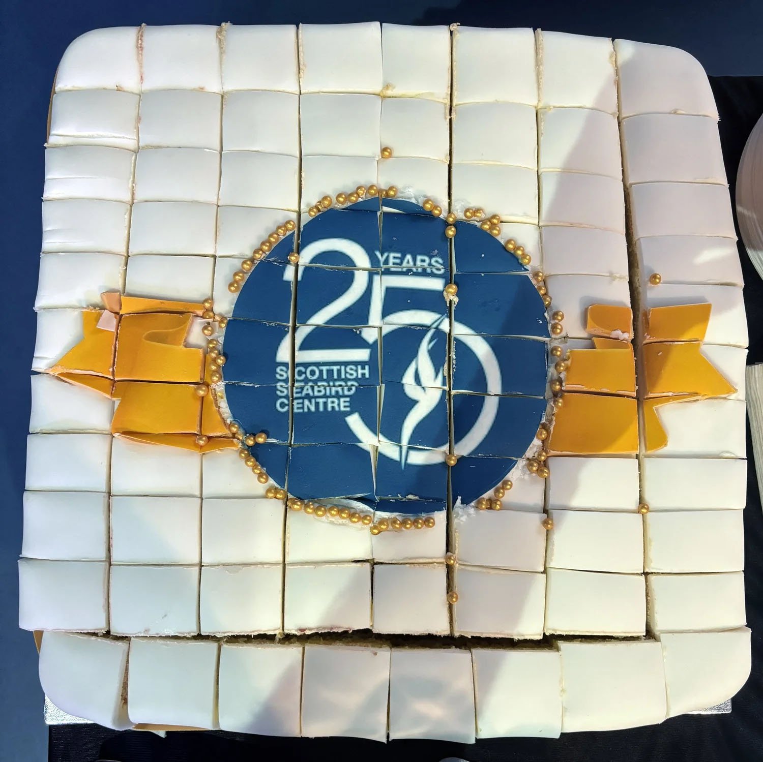
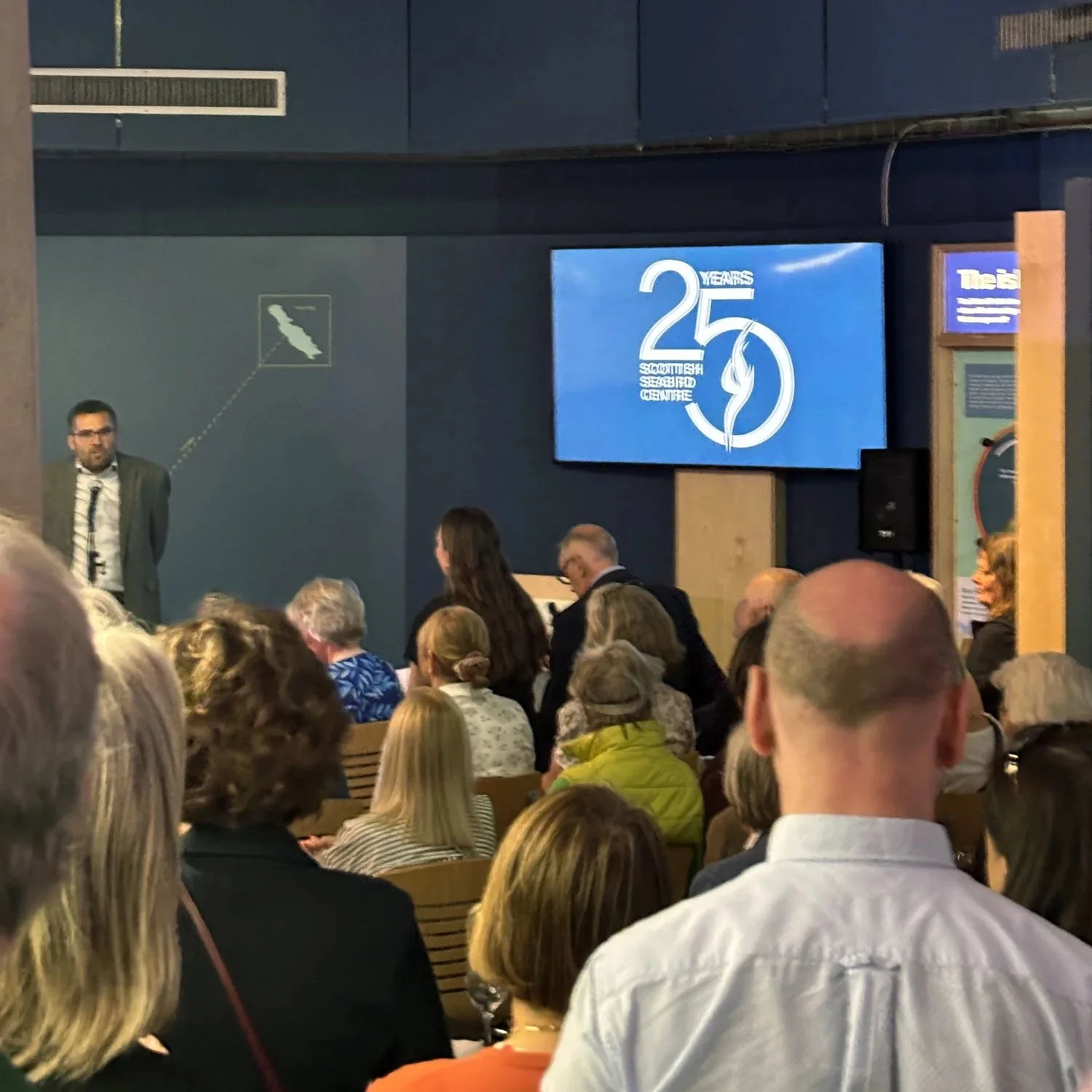
The anniversary identity helped bring twenty five years of conservation, education and community together under one recognisable symbol. From large scale event graphics to digital campaigns and printed materials, the design carried a sense of celebration without losing the character of the existing brand. Seeing the identity appear across the Centre throughout the year made the project feel genuinely connected to the organisation and the people behind it. A thoughtful evolution of a much loved East Lothian institution.